Rise Plasma
The future of plasma collection: modern, tech-forward membership model rooted in community.
Visual Identity, Art Direction, AI Image Creation
Project Lead: Little Plains Strategy: Melanie Levitin Web Design: Dana Kingery Development: Marc Gagnon
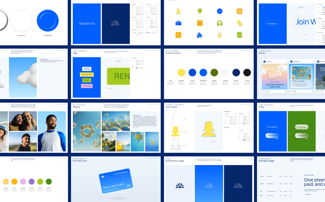
RisePlasma is built to feel uplifting, transparent, and modern. Every brand decision reinforces trust while removing traditional plasma donation associations. The brand world balances professionalism with joy—making the experience feel approachable, optimistic, and human at every touchpoint.
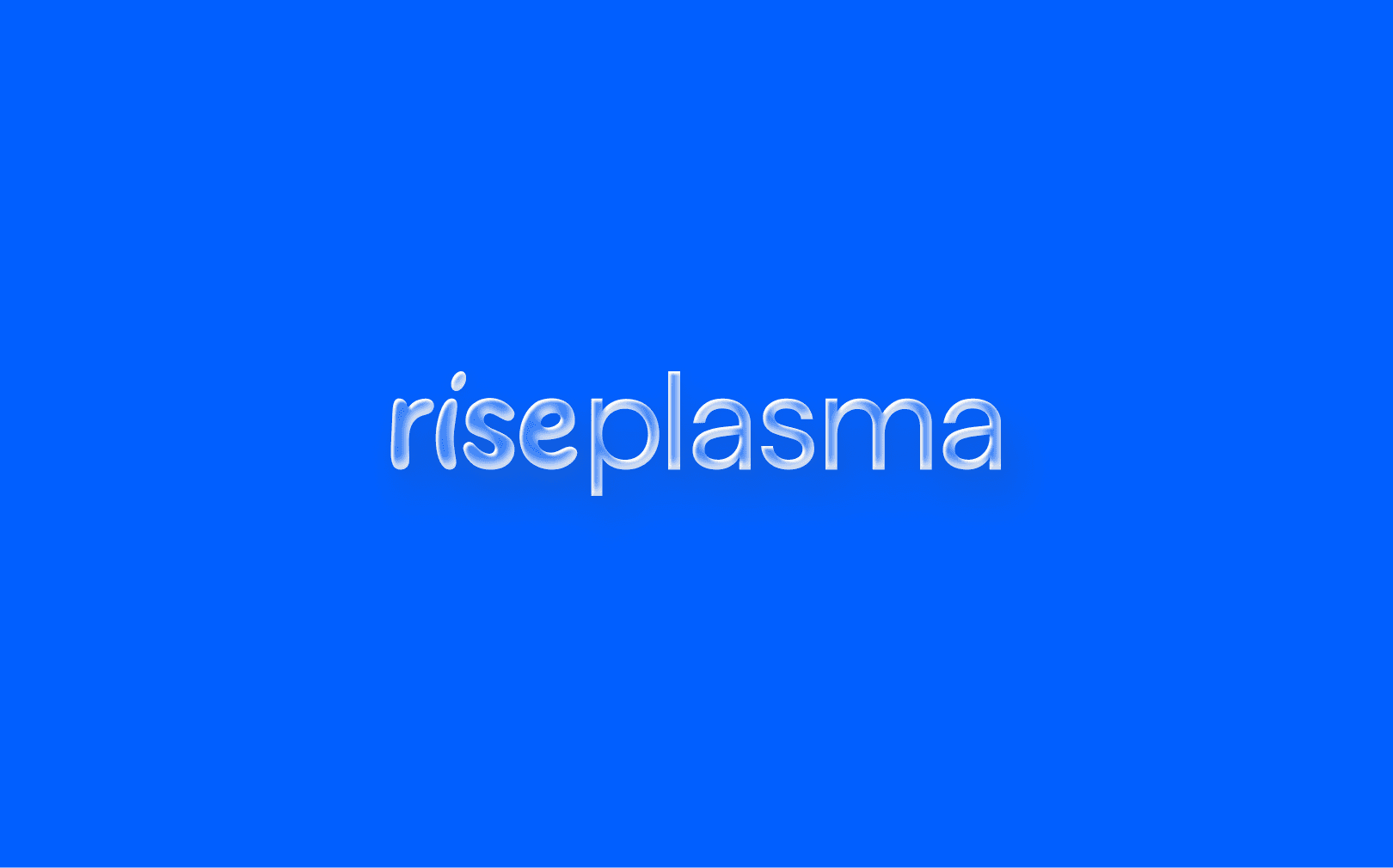
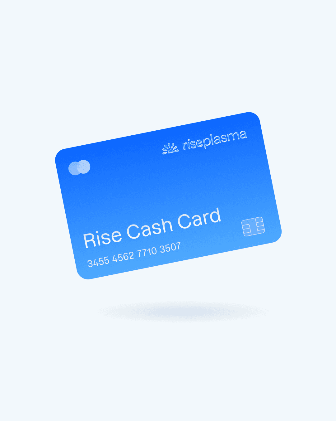
The logotype is composed of custom-crafted “rise” letterforms that feel soft, organic, and friendly, paired with lowercase typography to maintain approachability. The logo system is intentionally flexible, with primary, stacked, and abbreviated versions designed to adapt seamlessly across digital and physical applications while maintaining clarity and recognizability.
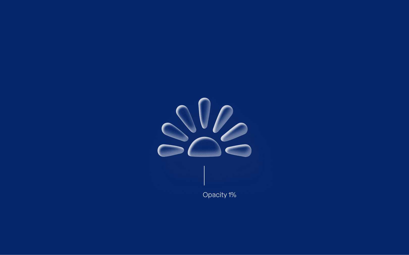
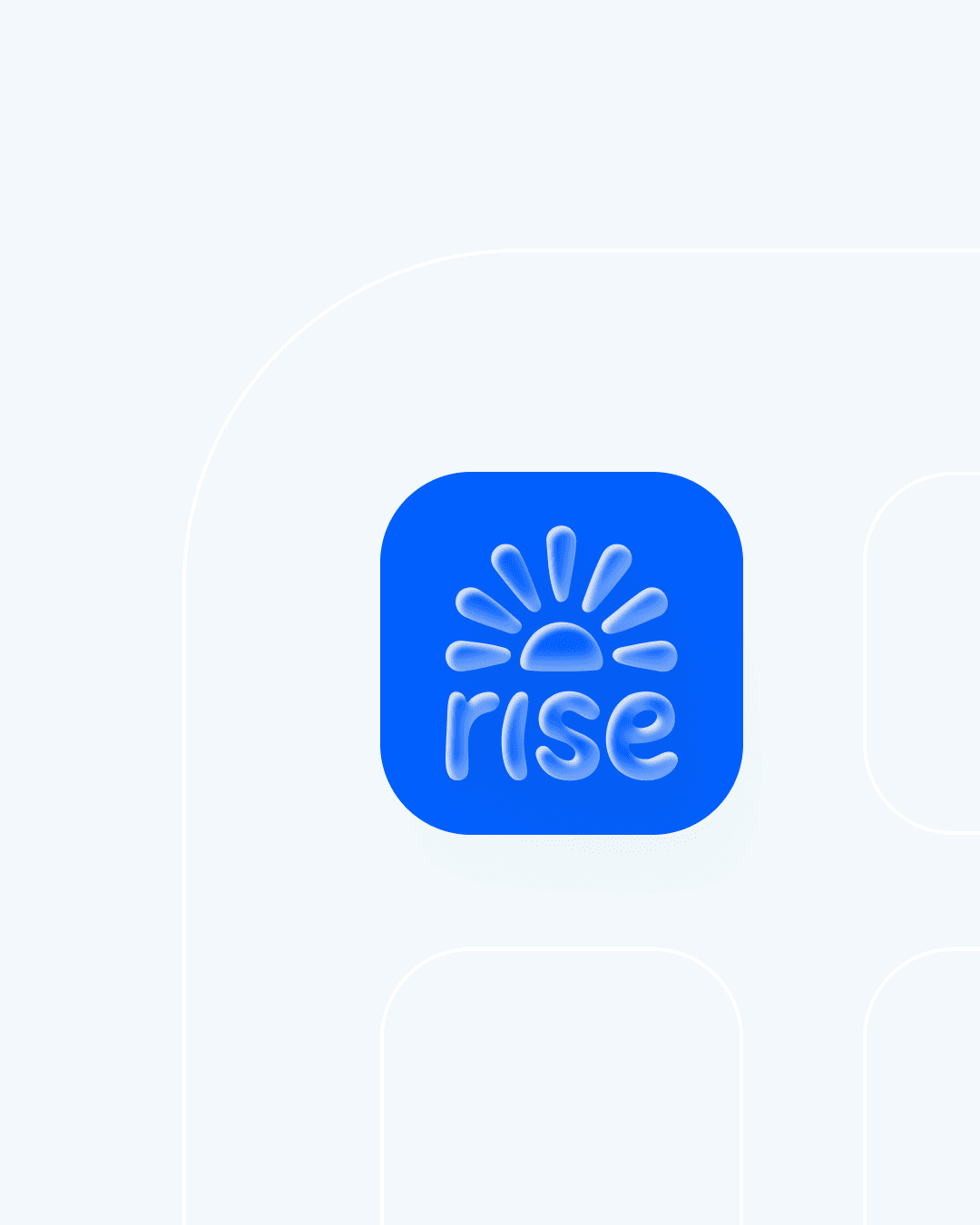
The brandmark is a symbolic sunrise built from the same organic shapes as the “rise” letterforms. It represents optimism, renewal, and upward momentum—core to the RisePlasma story. Designed to work independently or in lockup with the logotype, the brandmark brings an emotionally resonant symbol to avatars, signage, and digital interfaces.
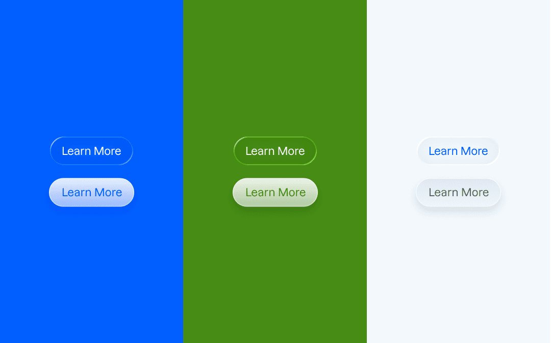
We designed iconography in an enamel-like style with metal outlines and layered depth. Each icon feels tactile and grounded, working harmoniously with the brand’s translucent UI elements. This system ensures clarity, consistency, and scalability across digital experiences while adding personality and polish.
RisePlasma’s color palette is energetic, bright, and optimistic. Signature Rise blues and vibrant yellows are balanced with clean whites, light blues, and grounded neutrals to create a system that feels joyful yet trustworthy. Secondary colors and gradients—anchored in sky, clouds, grass, and sunrise—extend the brand world while maintaining consistency and clarity.
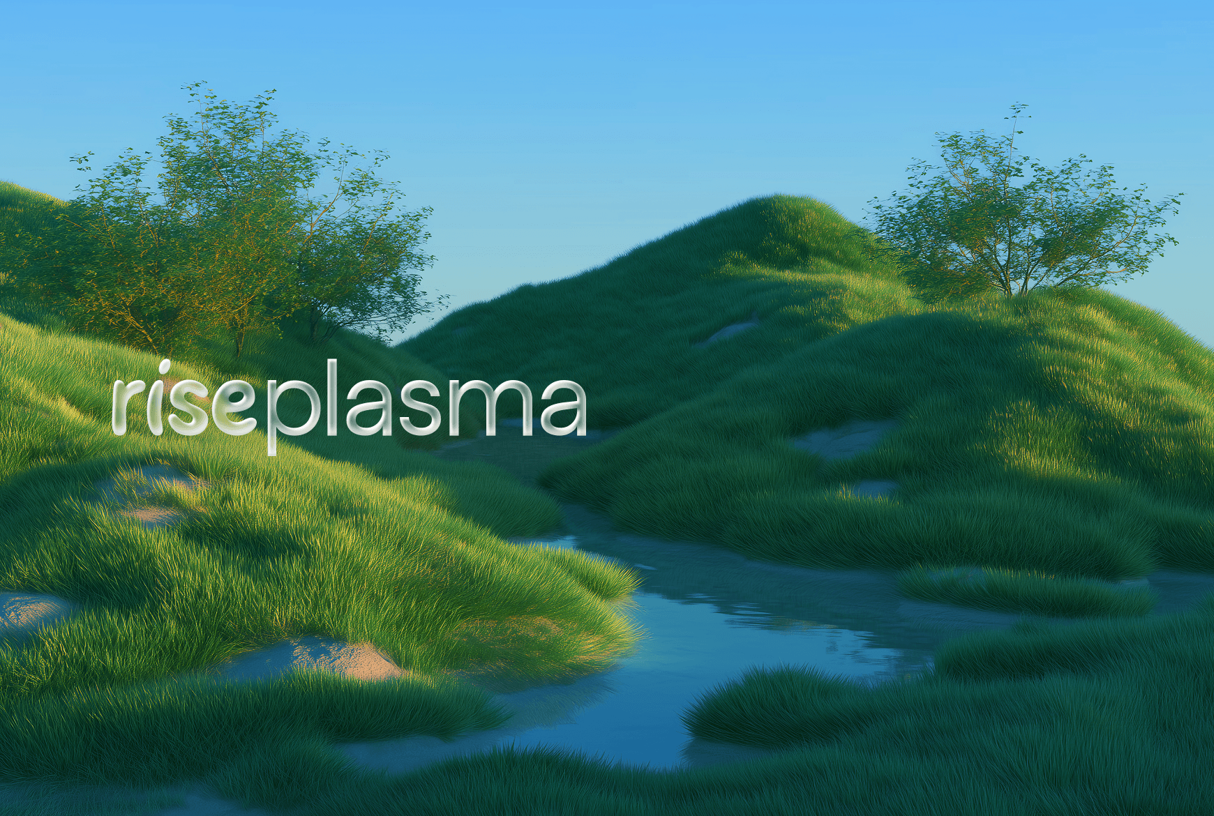
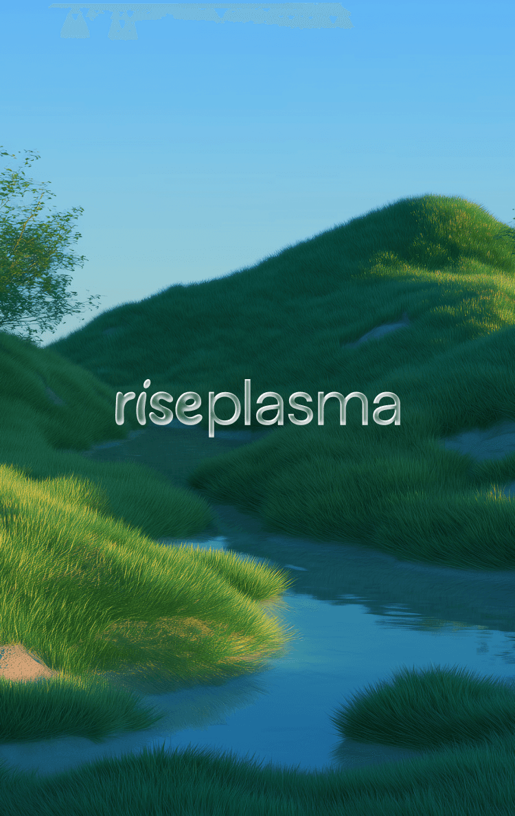
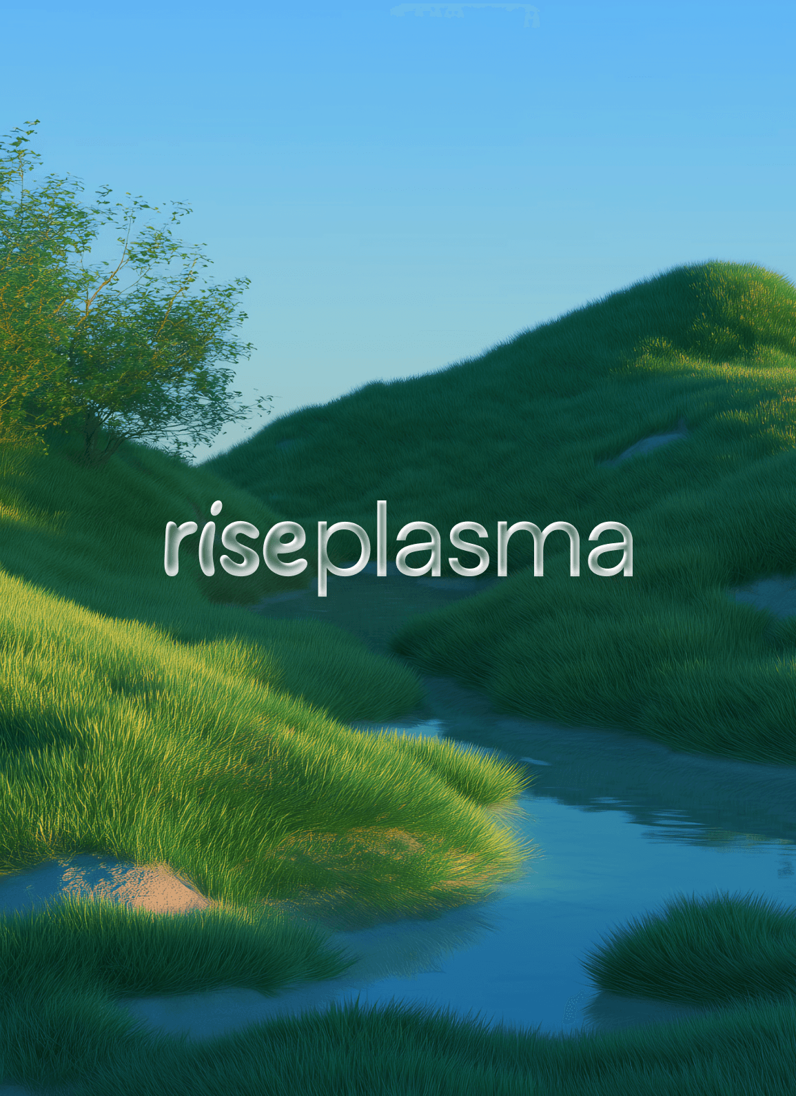
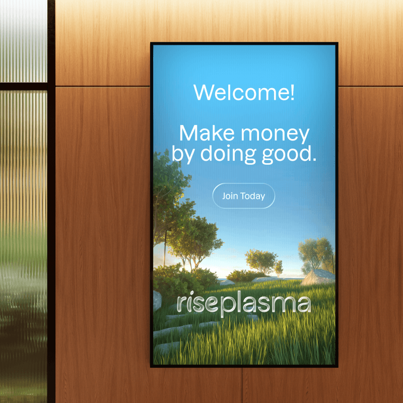
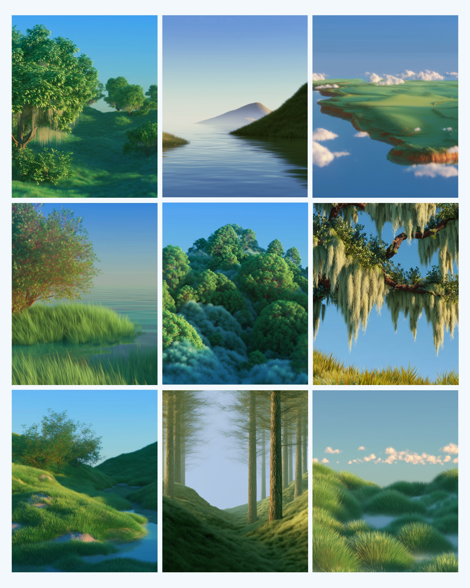
Finally, the RisePlasma brand world is brought to life through custom-rendered environments that feel playful, calm, and optimistic. Lush landscapes, soft lighting, and a cohesive color story create a recognizable universe that feels welcoming rather than clinical. These environments establish emotional context and reinforce the brand’s uplifting tone.
